Casa Eclaire
Deliverables
Brand strategy
Branding
Background & Challenge
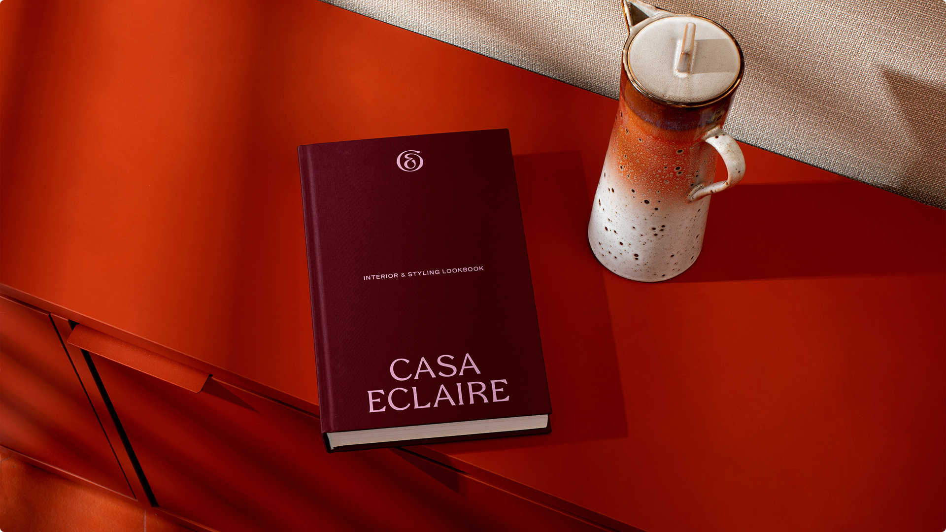
Casa Eclaire is an interior design studio in Amsterdam founded by designer, artist, and curator Anne-Claire Wesdijk. Anne-Claire is a young and talented designer with a special love for bold, eclectic interiors. She likes to get inspired by the dreamy riads in Marrakech and bold colours and textures from South America. Her style is a mixture of iconic design furniture and unique finds from local markets all around the world, ensuring the uniqueness of each interior she creates for her customers.
The challenge was to create a strong brand identity that reflects both the versatility in her services as an interior designer, artist, and curator, and her eclectic style of designing, while maintaining a clear and cohesive brand that is memorable and sets her apart from the competition.
The Brand Icon
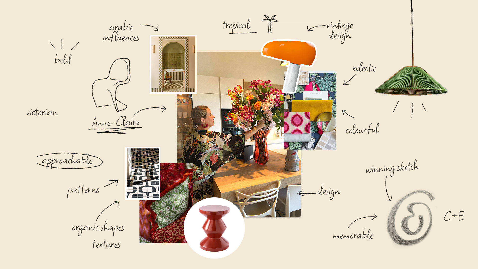
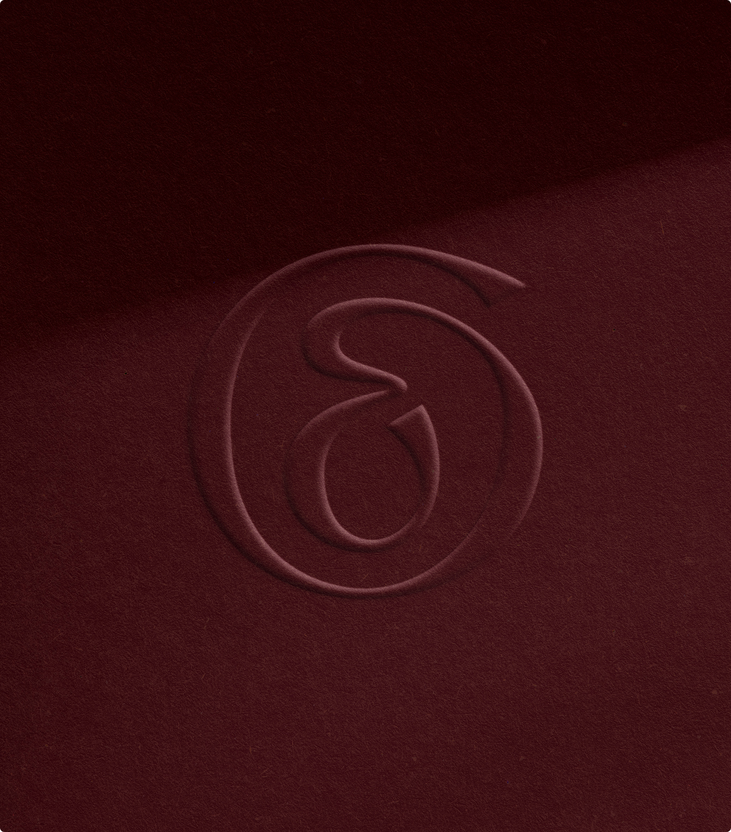
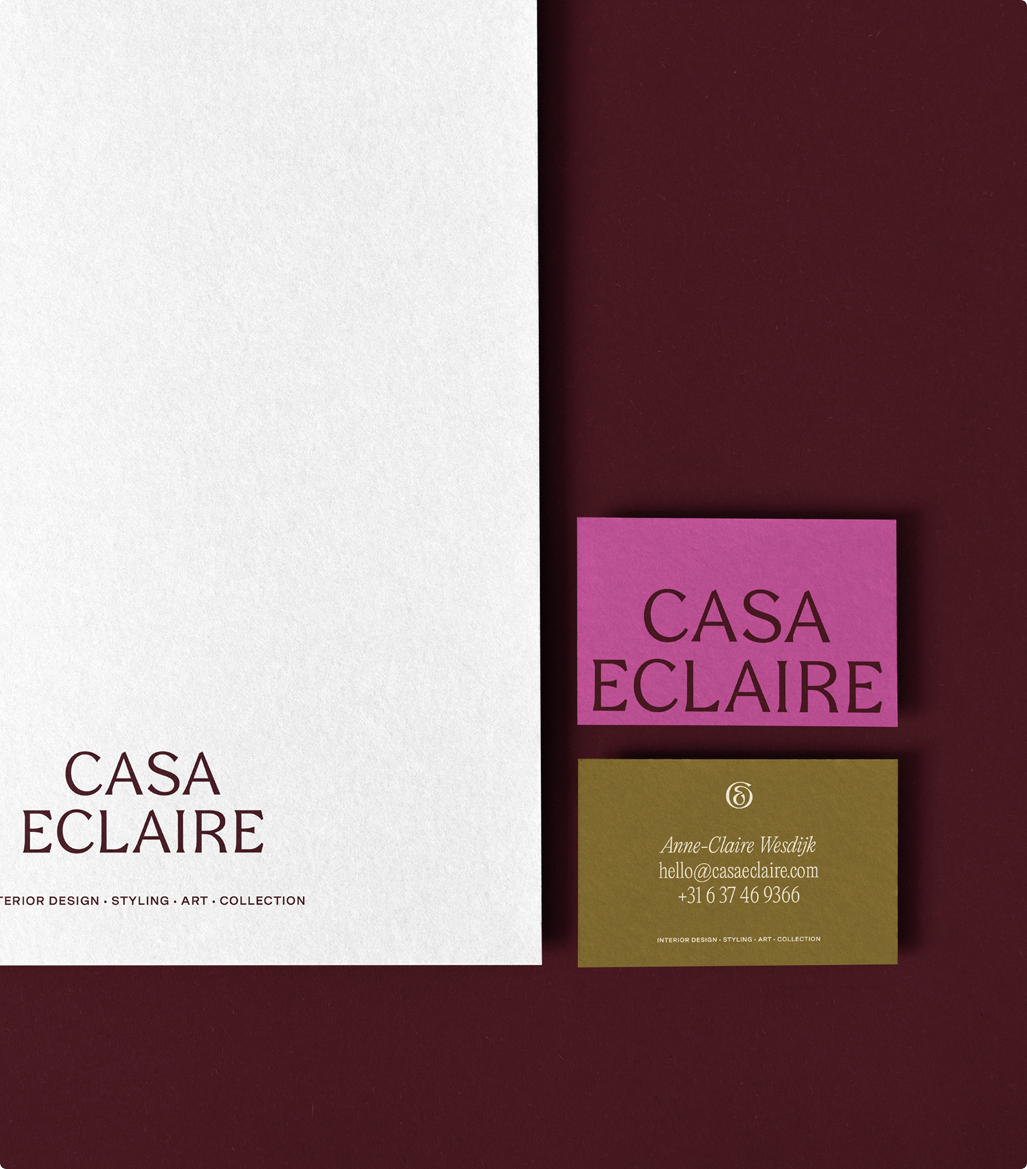
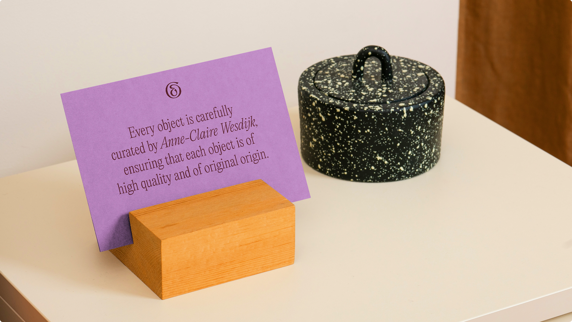
The process started with sketching the brand icon. The goal was to create an icon that was simple, memorable, and had a natural balance, while reflecting the core brand values. The sketch that stuck was the monogram combining the C of Casa and E of Eclaire. The monogram consists of a single smooth line, which makes it a compact shape and easy to apply. The icon is memorable, unique, and reflects Anne-Claire’s professionalism.

Brand Strategy
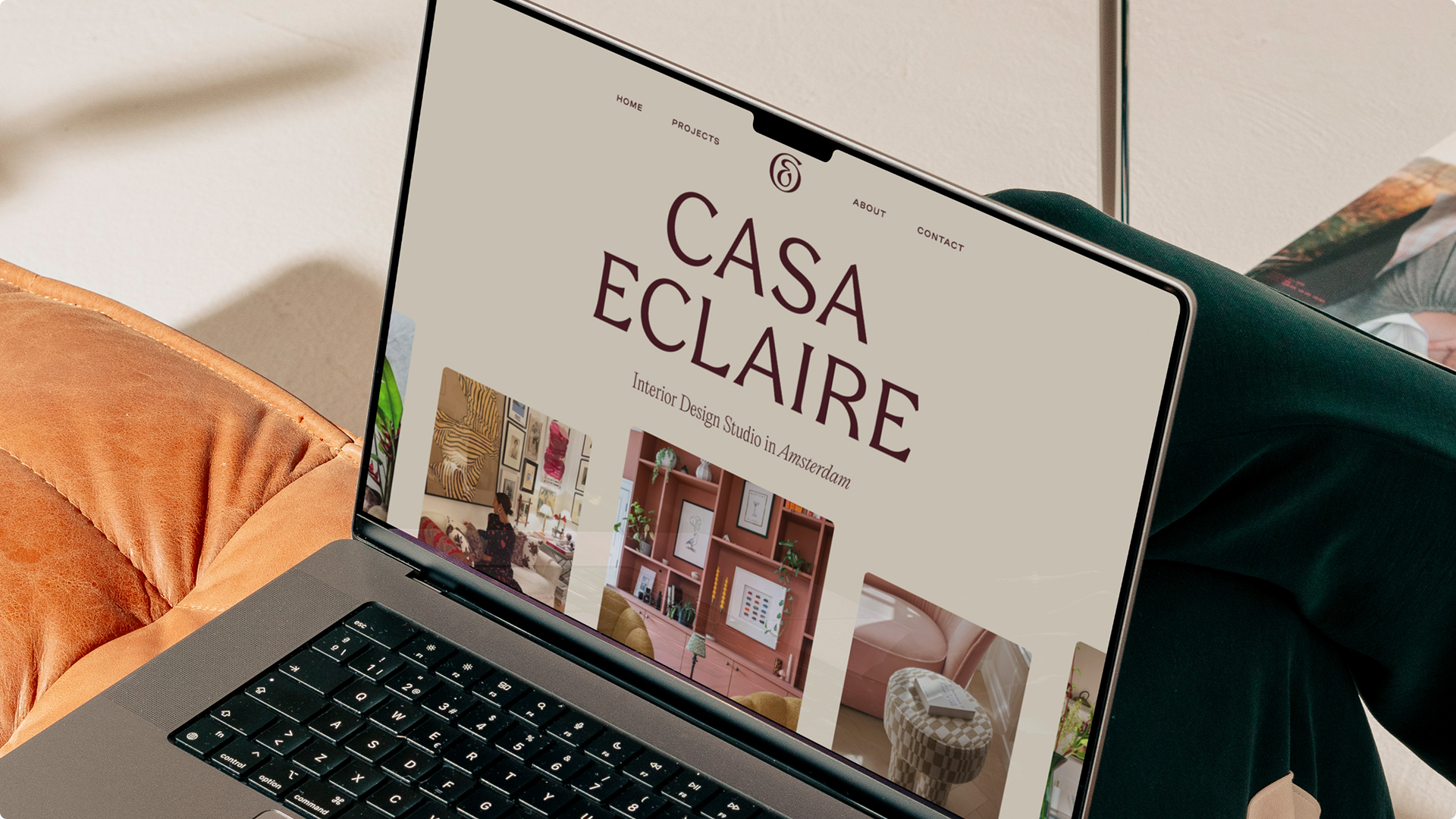
When researching the eclectic interior style, it’s easy to notice that the style is a mixture of multiple interior styles. The strength sits in creating the balance, making the interior as one cohesive whole. This was the goal for the brand identity as well. In the first impression of the style, you notice the bold use of colours, textures, and shapes. But when analysing it closely, the basis of each interior is always calm and clean. This was the solution for creating the cohesiveness in the overall brand identity look as well.
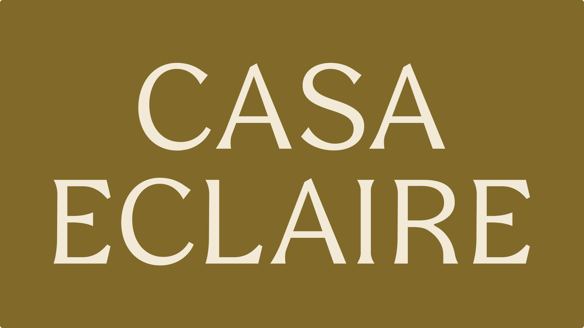
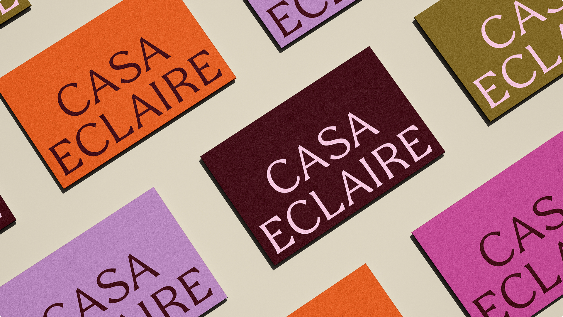
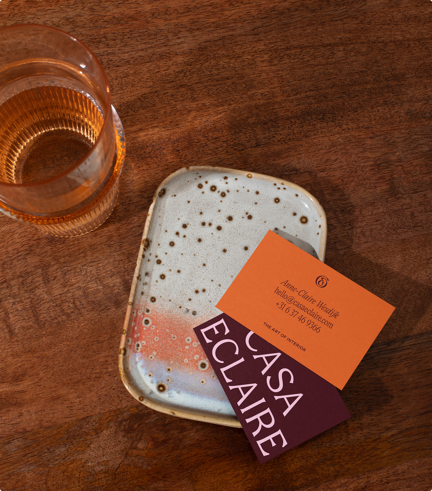
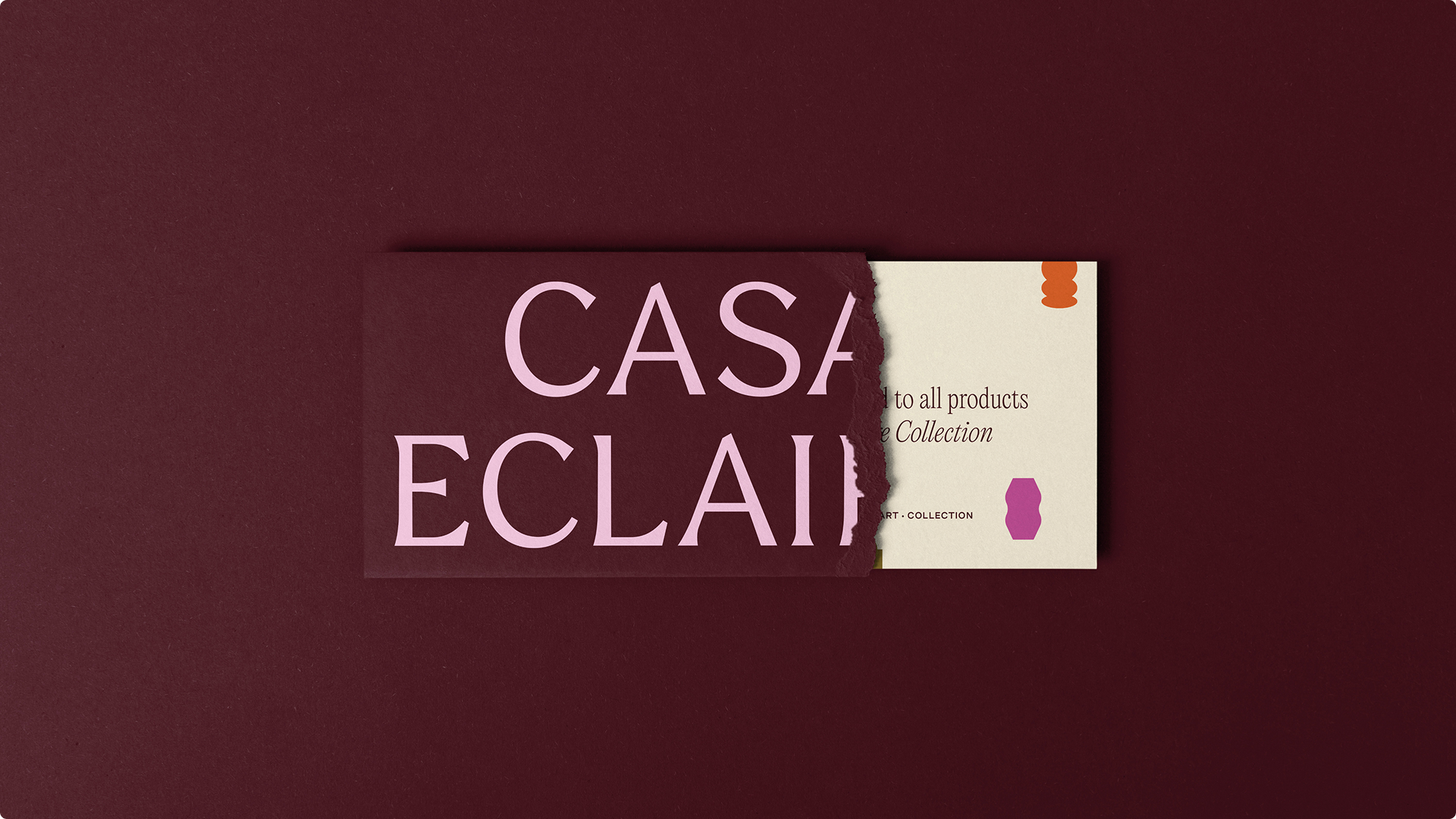
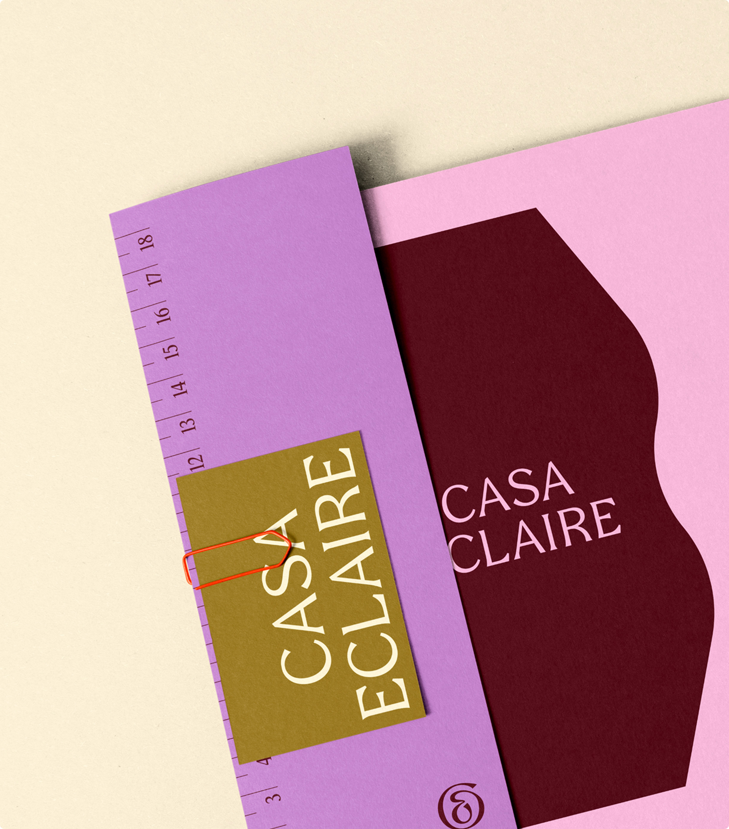
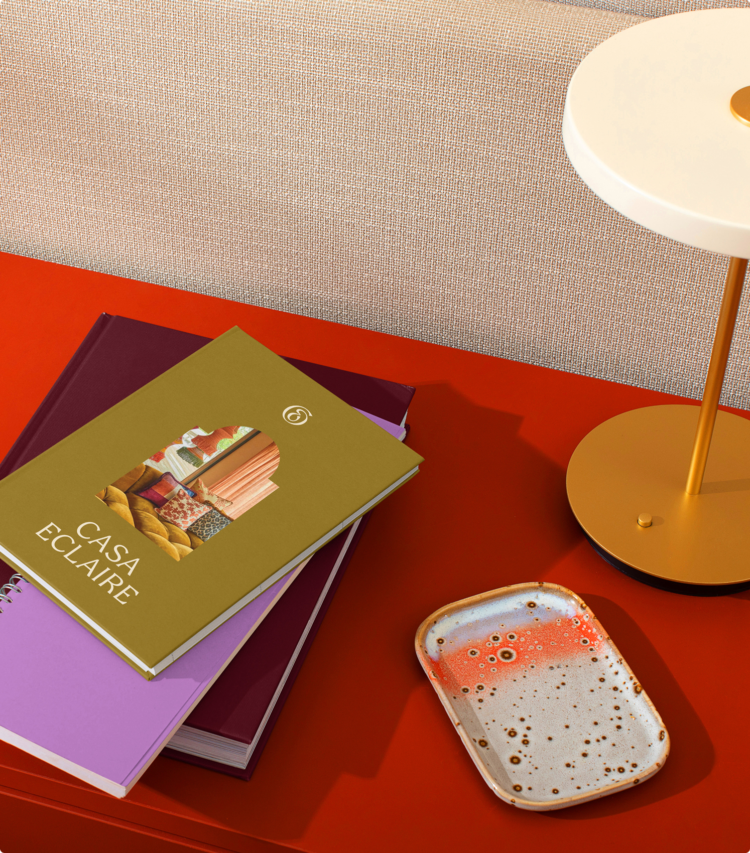
The typography of the word mark is custom-built and made slightly modern while maintaining its elegant look. Scaling the wordmark when positioned on assets and applying bold colour combinations was the design solution to maintain clarity and at the same time create playfulness that can be recognised in the eclectic interior style.
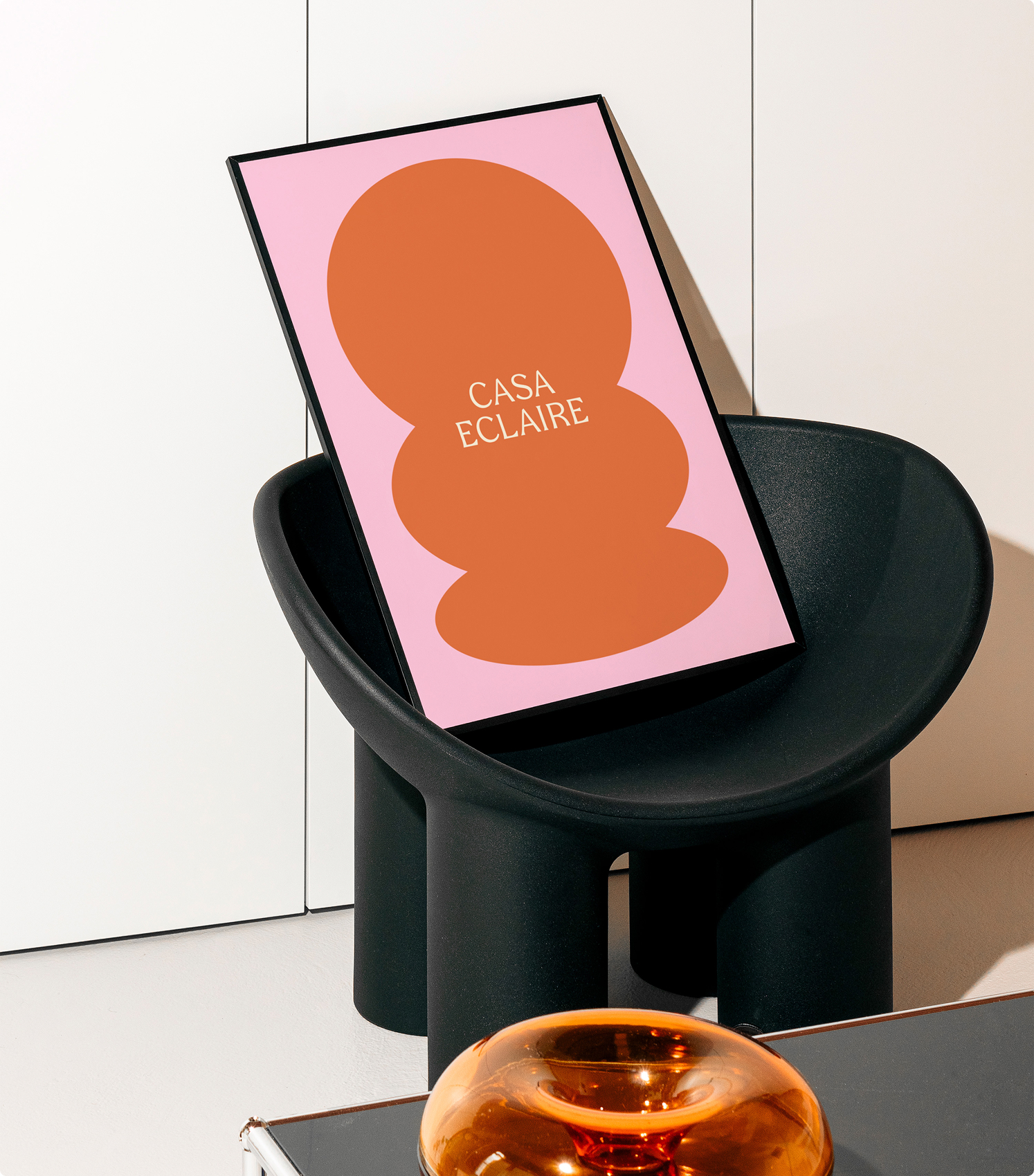
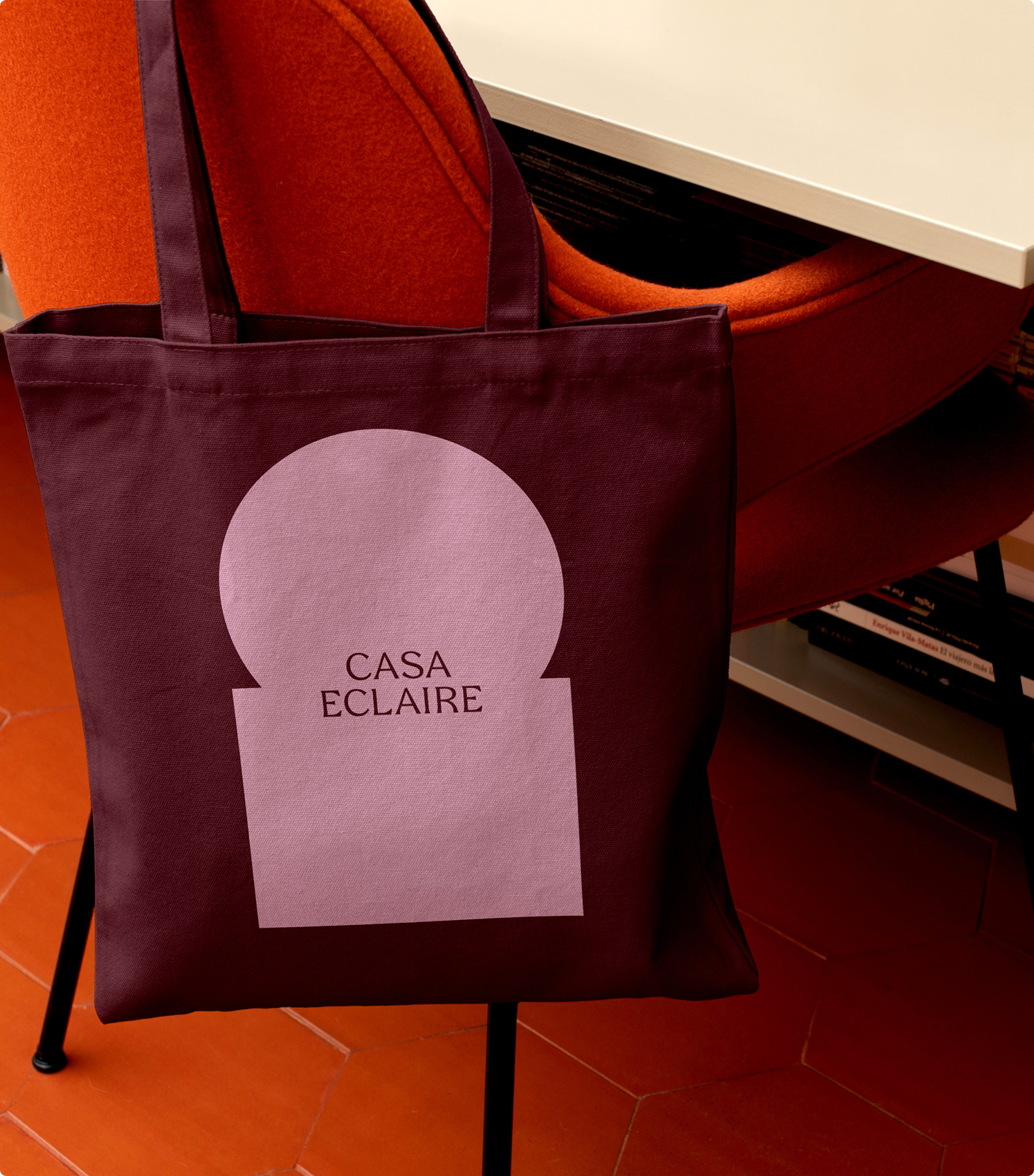
Silhouettes that are often seen in many Arabic and South American architecture provided a solution to create more depth into the overall brand’s image.
In combination with the elegant font, the overall brand identity creates a unique, personal, and crafted feeling that seamlessly fits with the eclectic interior style.

Anne-Claire Wesdijk
Founder Casa Eclaire
Timo didn’t just design a brand for Casa Eclaire, he translated my thoughts into visuals and gave my work a bold, elegant identity. It’s refined, full of character, and truly me . A creative collaboration that made the brand come alive."
Other work
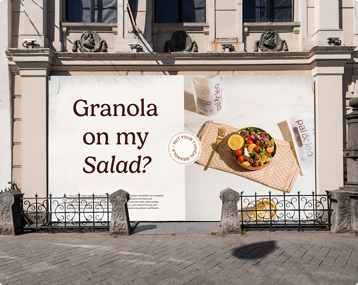
Pal & Leo

Cultcha Kombucha
Sign up for the latest work updates, blog posts and insights
© Timo Kramp 2014-2025

All rights reserved
